By Ciaran Ward on 13 Aug 2019
It’s a tale as old as time that a picture is worth a thousand words, it’s a tale almost as old as time that we consume information quicker when it’s in a graphic than in text... This little tidbit springs to mind:

So it’s not surprising that when it comes to social posts, users will retain 65% of the information they see in an image or video, versus just 10% of the information with no relevant image. We also see time and time again that ads with quality custom creative drive more engagement than those without. During our KPI study last year we ran a split test between creative created specifically for our KPI campaign versus ads made using stock imagery. The Cost Per lead for Wolfgang custom creative was 88% lower than the stock image and it received 500% more leads!
.jpg)
So within the ever evolving world of social media, that’s almost entirely visual, keeping your creative fresh and engaging has never been more important.
When we’re creating assets for social, on the outside we’re looking for interactions, likes, shares and click-throughs. But on the inside we’re trying to connect with the user to spark some emotion from deep down in their social scrolling heart. Using the right creative at the right time is vitally important, and when that creative is thoughtfully designed, it can convey the message efficiently and avoid showing up on users ‘another annoying ad’ radar.
Here are our 3 steps in striking the balance between great looking and great performing ads.
1. Your KPI Can Help Inform Your Format
Before the creative is started, it’s important to understand which format will work best for your campaign.
A great place to start is looking to your KPI. What are you hoping to achieve from this campaign? If it’s brand awareness or engagement, for example, video is a strong performer when it comes to getting results. Video is also a great format for gathering remarketing audiences to help your user travel to the next stage of the Funnel. Video has a bad rep for being an expensive asset, and it can be if you’re looking at a full length feature video that would be used in a LinkedIn ad. But you can achieve great results with lower costing snappier 15 second video for Instagram Posts & Stories. Creating cinemagraphs, animated text over static images, or parallax images can work wonderfully as lower cost video.

If you’re focussing on conversion and or click throughs static images can be a relatively low cost option, and easily repurposed on a wide range of social platforms such as Pinterest, Instagram and Facebook.
You can then consider telling the full story by bringing all formats together in ‘Facebook Instant Experience’ ads (the artist formerly known as ‘Canvas’) or Carousel ads.
2. Adapt Your Format For Each Platform
Now that you’ve an idea of what formats you need, (long or short form video, static image or carousel) think about where the message will be placed. Each social platform has their very own voice and purpose so it’s vital to tailor your creative for each platform- that could mean customising your image sizes, using entirely different images for each platform or even creating a whole new video specific for one platform, such as Instagram Stories. The more refined and customised your creatives are for each platform, the better chance your campaign has at performing really well
So before you start creating your assets, consider where your audiences are viewing your message and tailor it to fit the platform. Understanding the needs of each social platform will help you customise and adapt your creative for each:
Facebook images are bright & eye catching they are simple in look and don’t have a lot of details.
Twitter recommends uniformity and simplicity with all creative
Linkedin has a very professional focus with little room for fun
Instagram is all about perspective. Your shot or layout should be interesting, organized and artistic.
Snapchat is all about the fun personality
Pinterest images should be highly creative and custom imagery only!
3. Stay Consistent With Your Gorge Creative
Studies show that it can take up to 7 times of seeing a brand before it becomes ‘recognisable’ to a user. This means that consistency across your creatives in elements such as logo, colour and type choice is hugely important.
Some quick tips to look out for in keeping your social creative consistent:
Logo
Your logo should be included on all creatives, it doesn’t have to overwhelm the image or video and can be subtly placed in a corner. Whatever the KPI, brand presence on your social creative is always important.
Colour
Colour plays a huge role in the final look of your social creatives. Colour can affect people’s emotions and reactions to a creative so be sure to choose the right colours to get the right reactions.
Type
Type is another important element that can help set the tone of your social creative, it’s so very important to choose the right Typeface for your brand and keep it consistent across all creatives as it helps to keep your message consistent. Each Typeface tells a story, so make sure you’re telling the right one.
A bit of an extreme example but the below shows what we mean when it comes to Typeface example.
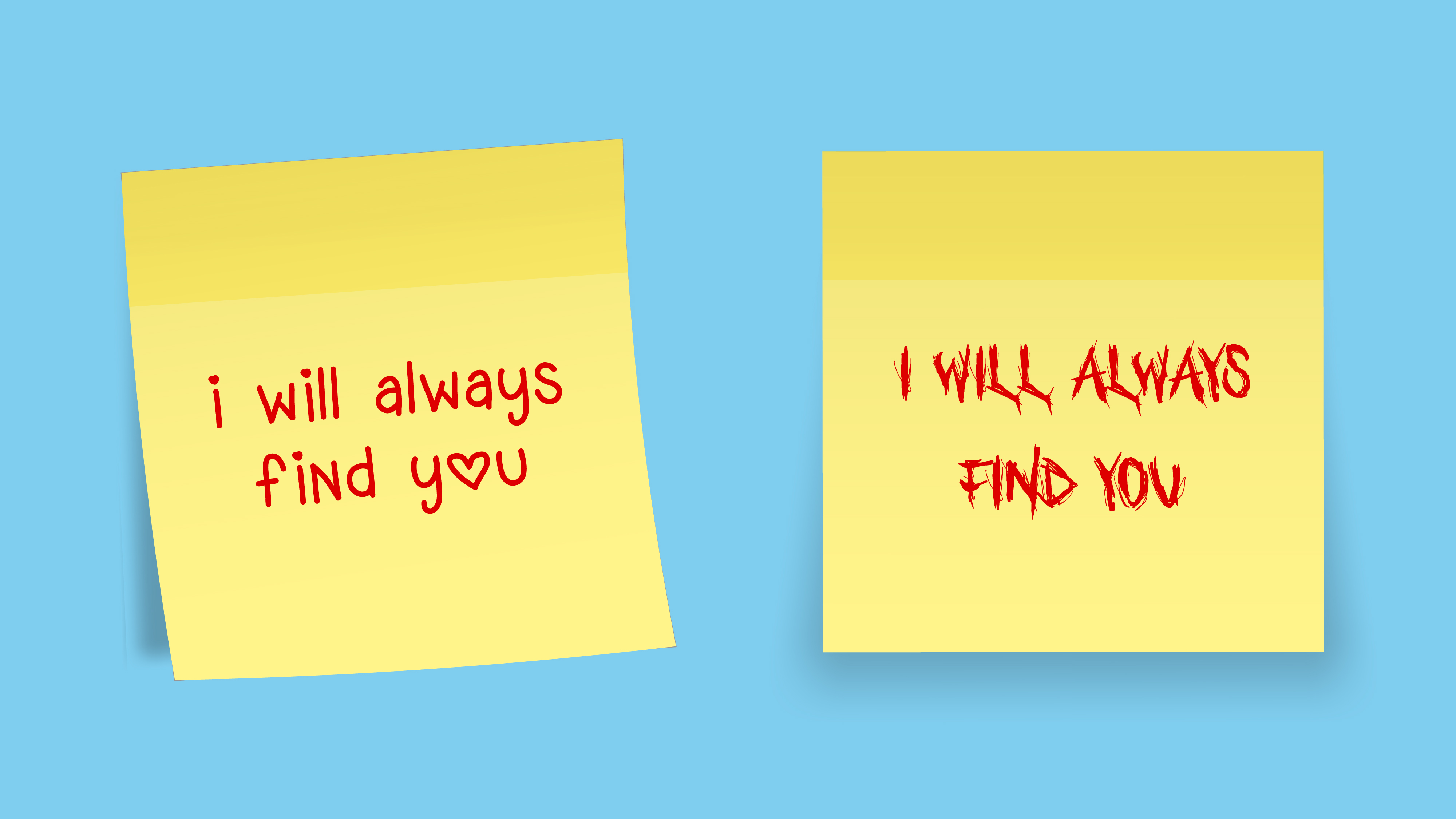
We won’t even get into how the internet feels about Comic Sans, poor Comic Sans.
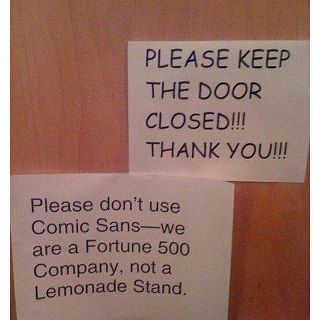
It’s the consistency in quality creative ads that will help your audience form a clear understanding of your brand & your message.
Finally!
Just remember, the single most important aspect of social creative is to deliver your message as simply as possible, users won’t hang around to understand a complicated ad. We’ve learned from working on countless social campaigns that it’s important to keep your creative new and refreshed every couple months, and don’t be afraid to try out new ideas to stand out from the noise. Your KPI gives you format, the platform gives you tone and consistent quality creative gives you results.


