By Sarah Moyles on 20 Apr 2018
Inspiration for great content can strike at any time. It could come from a passing comment from a loyal customer. It could stem from an exciting new product that you’re about to offer. Or it could just be something you want to get off your chest (there’s nothing wrong... in fact, there’s everything right... with a dollop of personality!) The creation process itself, however, is more cut and dried and most often built using two primary forms:
- Desk researched content
- Primary research content
Desk Researched Content
The internet is full of content which has been driven by hours of desk research; some of it good and some of it is, well, complete crap. Desk research is a really efficient way of turning around insightful content quickly and when done right, it can be just as effective as any other type of content in allowing you to reach and communicate with your target customers. Unfortunately, it's often not done well leaving some content feeling generic.
Primary Research Content
Leaving your desk every now and then and developing your own primary research can inspire truly wonderful content. Naturally, as it requires that little bit more time and passion, content based on primary research is harder to come by, but far more likely to leave an impression. Embrace the challenge of finding something brand new to tell the world. Explore your own data to reveal hot trends. Get out and chat with your customers, the audience you're trying to reach with your message, about what’s big in their world right now. Spend some time speaking with industry leaders and leverage their knowledge and experience to get your message across.
When you create content based in primary research, particularly when you’ve drawn on unique contributions from real people, you bring an invaluable aura of humanisation to your message.
Here are two cases I've seen the human touch powering up content creation.
The Wolfganger's Noggins
If you're reading this I hope you already are, or will now be, a regular visitor to The Wolfgang Blog. We love sharing our innovations and research findings with you here, but about twelve months ago it hit us; it's not very personal. I mean, sure, you could see the author's name but there was no author image to show you the person speaking to you. We were sharing the posts on social with gorgeous creative images, but again it would be difficult to make a connection between the content and a real person. This is a real shame considering Wolfgangers are often up on stage delivering talks or tweeting about digital marketing. We're a personal bunch!
It's no secret that people will remember great imagery and our creative team has definitely made The Wolfgang Blog a colourful and memorable place. Next, we needed to make it a more personal space where readers could draw the link between Kenia that spoke at HeroConf and Kenia that wrote about Emotional Ad texts.
Back in 2005, a study found that people's brains reacted differently to the faces of specific people. Rather than getting too distracted by the science, we decided to test it out and started putting Wolfganger's noggins on blog post's, focusing in particular on the images we shared on social media.
Here's an example of the before and after for one of Robbie's posts:
Before

After
Results
We analysed 104 tweets over two months. These tweets, which linked to Wolfgang blog posts, showed one of two creative styles, similar to the examples above. One tweet would be posted without a Wolfgangers' image and then a similar tweet would be posted with their noggin included. We found that engagement was 76% higher on Tweets with Wolfgangers' noggins.
After we shared the results internally, Anna from Team Social highlighted that Twitter had actually carried out some similar research into this logic with video too. Their findings showed that showing people in the opening moments of a video can make people twice as likely to continue viewing.
Virgin Media Humanise the VMBiz Blog
So how could Virgin Media Business take these findings and make a human connection with their audience? Well, their audience is Irish SMEs so why not let business leaders from Ireland do all the heavy lifting. Virgin asked three business bosses about their best decision of 2017, a book that inspired them and something they might do differently if they had a second chance. The insights were published on their blog alongside a gorgeous infographic, humanising written storytelling while also appealing to the part of our brains that loves the visual storytelling approach.
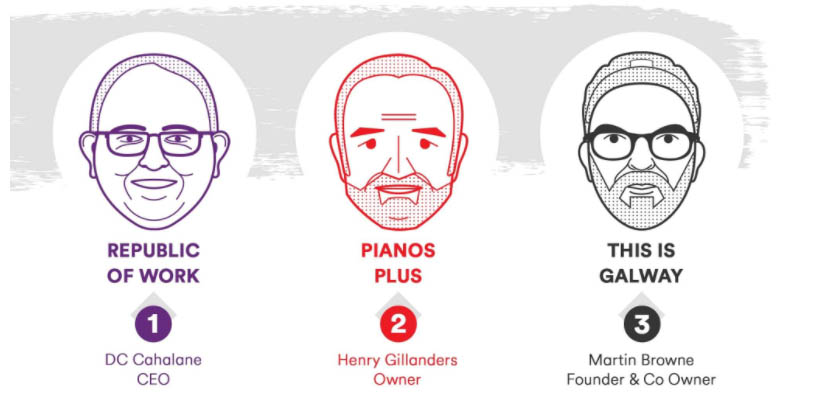
This post nailed everything the science was telling us from both our research and external research:
- Human brains are wired to react to visuals
- We're also wired to react to other people
Would the science stand strong?
Results
Since being published, Virgin Media Business's post on "Leadership Lessons: Decisions That Shaped Irish Businesses" has proven to be one of the most popular. While it has been popular in terms of Pageviews, we're much more interested in Average Time on Page as this is more representative of how people are reacting to the use of human content. This post which went all in on humanised content held readers' attention 40% longer than any other post on the blog.
The Wolfgang Essential Takeaway
Humanising your content has loads of practical benefits, including the creative process is faster because you're basing everything on fact and statements of others leaving less room for interpretation. More importantly, when you add that human touch to your content, your audience is likely to become much more receptive and much more likely to engage as they can relate to another human being rather than a faceless brand. Put some humanity into your content and you’ll reap the rewards.

