We’re employee-owned, every team member you work with brings the mindset of a business owner.


If you were to do only one thing to improve conversions on your website, make it purpose built landing pages.
Landing pages are an excellent lead capture tool. Without them you’re missing your opportunity to turn your website visitors into customers. With the appropriate search optimisation, your landing pages can rank for more specific search terms with content that better matches that particular search intent.
According to Nifty Marketing, 76% of businesses are still using their homepages as a landing page. Your homepage should not be the only landing page for your site. Homepages are used to introduce users to your brand, to get them to browse your site and to encourage them to explore your products or services. Homepages also have navigation bars, multiple calls to action and links to other pages, tempting the user in multiple directions.
*Warning* this post is a fairly comprehensive introduction to landing pages, so it’s not the quickest read. But, by the time you’ve worked your way through this content, I’m confident that you should have a solid understanding of landing pages and how to use them to improve your online marketing.
Before I get into the elements of a good landing page, let’s take a look at what exactly a landing page is and how it’s different from your other website pages; particularly your homepage.
A landing page is a standalone web page, created specifically for the purposes of a marketing or advertising campaign. Unlike a typical homepage, landing pages have just one purpose - to focus the user on one single action.
For example, the mission of a given landing page might be to get a user to;
Landing pages typically do not link off to other pages, reducing distractions and focusing on the conversion.
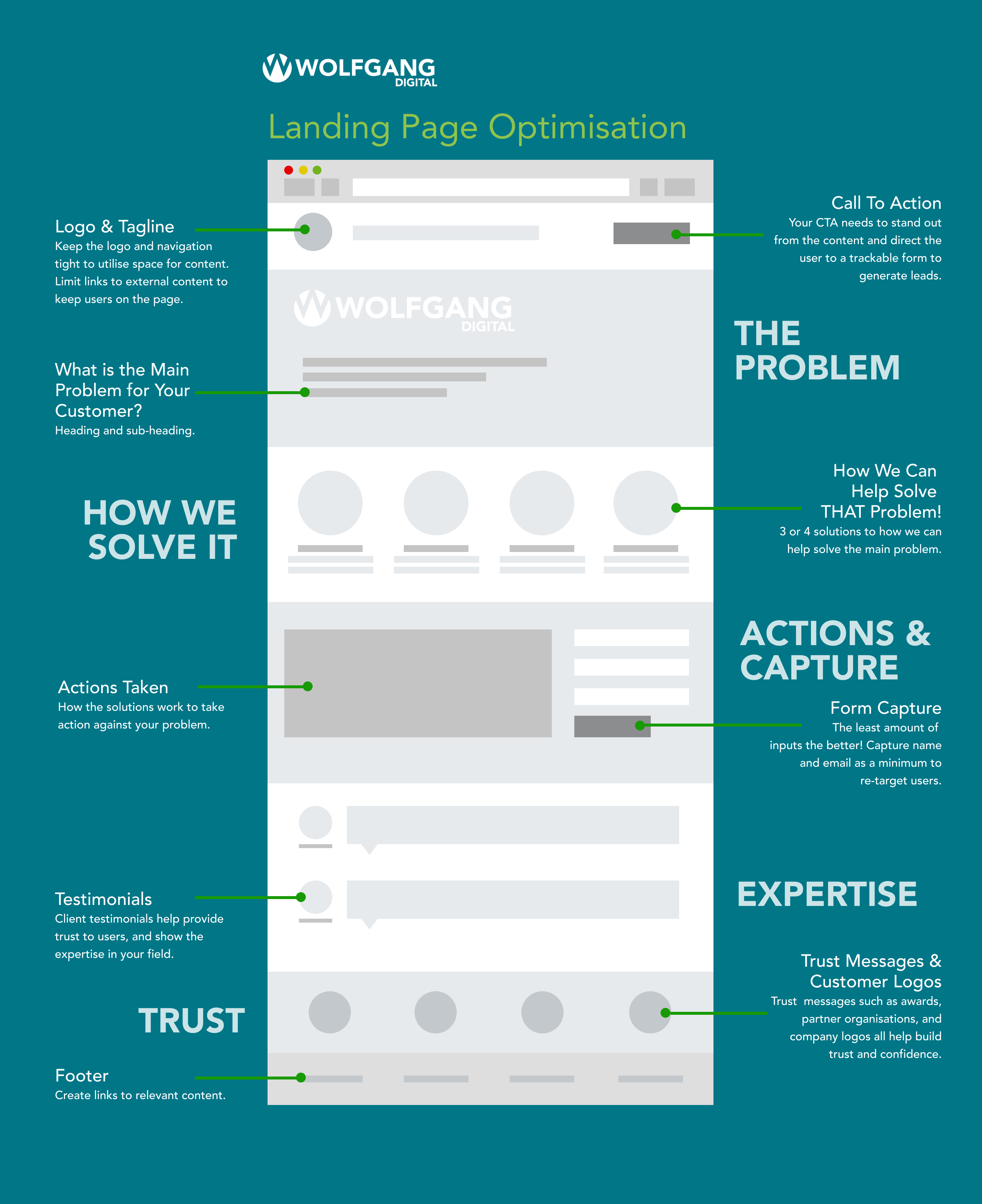
Now that we’ve cleared up what a landing page is and why it's important, let’s talk about some of the elements of landing page design. For reference, here’s a handy infographic that outlines our tried-and-tested approach to building landing pages to boost conversions. It can be implemented across any company, product or service.
This approach focuses on your customers, their biggest issues, how you can help solve them, backed up by your USP and your expertise, while also building trust in your brand and following through with a compelling call to action.
Our typical layout looks something like the schema below, addressing the biggest issue your customers are facing and how you can solve that problem.

Speak to your user’s pain points. What keeps them lying awake at night? What solution do you have to solve that problem?
Write a Killer Headline.The headline should grab the user’s attention, and resonate with a particular issue they’re having. It tells them, “Yes, you’re in the right place and here’s what you can expect. This is perhaps the most important part of your landing page as it sets the stage for the rest of the content. Only 20% of people who scan your headline will continue reading your content.
For your landing page to convert, your headline needs to promise a very specific result. The best headlines create a need for the user, while also conveying a sense of urgency and uniqueness of your product.
Your headline should be the main heading on your page, and should include some of the keywords from Adwords campaigns. For companies with multiple services, products or target demographics, you can create landing page variants with different headlines, and serve them to the user depending on their search terms or location.
The next piece of copy should be concise and engaging, touching on how your product or service can address the issue at hand.
You want your potential lead to read these benefits and believe they can’t live without your product or service. Keep benefits short and concise - quick bullet points are much easier for people to digest than lengthy paragraphs.
Your actions copy should outline your unique selling proposition, what sets you apart from your competitors in your approach and results.
Statistics are a great way to show how your actions create winning results for your customers. Social proof helps reassure visitors that they are making the right choice by choosing you over your competitors.
Depending on your type of landing page, it will most likely include a form to capture customer information. Include as few form fields as possible. Limit it to Name and Email if possible.
HubSpot recently researched the contact forms of 40,000 of their customers and found that conversion rate improves by almost half when the number of form fields are reduced from four fields to three.
Avoid asking for age, address or telephone number, since those tend to turn people off the most. (You can always request more information after the conversion.) One column forms with the form labels placed above the inputs are the easiest for users to scan and fill out. Make sure your inputs are large and easy to click into.
CTA’s are possibly the most obvious and persuasive method of structuring a landing page. You don’t need to be subtle with them either. Shout loud and proud, it’s perfectly fine to allow your CTA to dominate other sections.
Your call to action should be big, bold and catchy, standing out from the rest of the page. CTAs should have a clear message and compelling action - avoid terms like ‘Submit’. Action verbs perform way better on your subscribe button. For example, “Save your seat”, “Grab your copy”, “Download it now”.
The colour of your CTA should be in a contrasting colour to the rest of your page, so pick a colour on the opposite side of the colour wheel from your page’s primary colour. If using lots of blue, for example, an orange button would stand out best.
The CTA can appear more than once on the page and have different messaging as the user scrolls down through your content, but the first instance of it should always appear above the fold. The main goal is simply to give visitors multiple opportunities to convert on the page.
Customer endorsements help reiterate what makes your product great, and who it is for. Testimonials work really well in providing external validation, but they work even better when they focus on measurable results. For instance, “Wolfgang Digital increased my conversions by 300%”
To build trust with your testimonials you should accompany the quote with the full name of the customer, their position within their company, and a profile photo.
Testimonials should be relevant to the user group you are marketing to. Choose testimonials that are as precise as possible about the problem they faced and how the product helped, using precise numbers when possible. When potential purchasers see that other consumers just like them have received the promised value of your product, it puts them at ease and removes a substantial emotional barrier to purchasing.
Build trust and confidence in your brand by displaying the logos of your well-known customers, any awards you have, or partner organisations. Include “as featured in” logos for any publications or sites you’ve featured in. Logos from resources you’ve been mentioned in are trust signals that instantly increase your conversions.
Now that you know the basics of a good landing page and are ready to publish, the most essential action going forward is to continuously test your landing pages to see that every element is working to achieve your goals.
Once you have published your page and are tracking conversions, you can measure what areas of the page are getting the most and least interaction and tweak them accordingly to improve conversions.
By tracking the performance of your landing page you will be able to:
With an ongoing testing plan in place you can test different content layouts, change the colour of your CTA button, or interchange images to see which one has the more positive impact on conversion rate. This iterative process will not only help you increase conversions over time, but will also help you get a better understanding of your target demographic and what messaging and content is most compelling to them.
Now that you know what a landing page is and how to craft one, the next consideration is when do you use them?

If you are a new brand or in the early stages of building your customer base, gathering emails is the perfect place to start. You can later re-engage these prospective customers through email or social media ads.

Your landing page can rank higher organically in Google search than your homepage if optimised correctly, targeted to specific keywords and matches your customers’ needs.

If you are running Adwords campaigns, direct users to a landing page rather than your company homepage. You can send users to different landing pages depending on the campaign, serving them more personalised content and focusing on conversion.

Similarly to paid search, you can build specific landing pages to direct social media traffic to, giving visitors a tailored, distraction-free experience of your product or service. Facebook, LinkedIn or Instagram ads can all be directed to different landing pages with creative, enticing and witty content that speaks directly to your type of customer or their demographic.

If you are considering a new design or design refresh for your website, landing pages are an excellent way to test what works and doesn’t before spending time and money on large development projects. With a stand-in landing page, you can track where users are clicking, what messaging is most engaging for them, and what ultimately drives them to convert before building out an entirely new site.

If you offer SaaS, letting users sign-up to trial your product is the best way to generate leads while capturing their email. A landing page is the ideal solution to capturing conversions, standing alone from your website, there are less distractions such as navigation bars. Having one clean and focused design makes it easier to measure conversions from one entry point.

For new campaigns or promotions, landing pages are a direct, goal-oriented route to get users to convert. You can create a different landing page for each campaign you are running, focusing on campaign-specific content.
A high converting landing page is a place that demonstrates the value of your product or service in a concise and action-driven way. It’s a place where customers click, people buy and you earn revenue. Creating a powerful, high converting landing page requires nailing the basics, ongoing testing and knowing when to use them.
Build out and optimise your landing page, track conversions and you will be well on our merry way to engaging your visitors and converting them into customers. Implement these steps and boom, you have yourself a winning landing page!
Get in touch with our CRO team to discuss how landing pages can benefit your business.


Partner with a 6x Best Global Agency Winner that's as invested in your growth as you are.